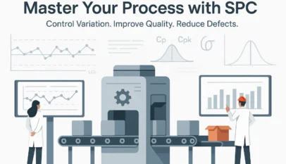
Another technique for developing a process control system is Statistical Process Control (SPC).
An SPC chart is nothing more than a time-ordered graph of your process data. When these data are plotted using statistical software, the resulting graph outlines the expected extent of variation of the data. Since the expected range is known, anything outside of that is considered a special occurrence that needs investigation and correction.
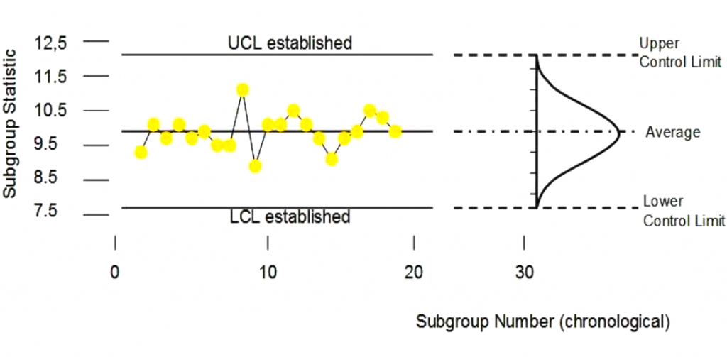
SPC charts can monitor either your process Xs, your process Y (inputs or output), or both. In the long run, SPC charts can help reduce rejects and rework, boosting productivity.
- Purpose of control charts
- Characteristics of control charts
- Use of control charts
- Creating control charts
- Translate various control charts
- Reacting to control charts
Statistical Process Control
- Every process has two types of variation
- Inherent process variation (common cause)
- Variation due to an assignable reason (special cause)
- SPC highlights common causes & special cause variation
- Monitors long-term process performance – shows boundaries of acceptable performance
- Used for continuous and discrete data
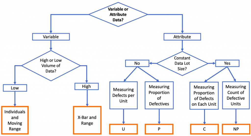
Based on your process data, you can find out what chart can be used. Once you have collected the data, you can use statistical software to produce the appropriate chart(s) and continuously monitor the process.
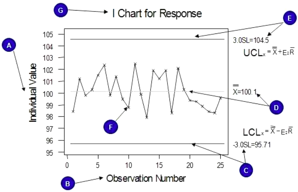
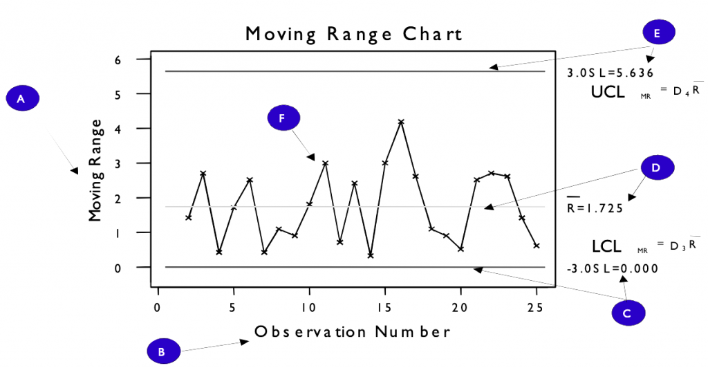
Individual and Moving Range Chart
- Used with time-ordered data to detect the presence of special cause variation
- It can be used when no rational sub-group exists, such as
- An office metric that is calculated once a day
- An expensive, destructive test is done once a shift
- It consists of 2 control charts
- Individual Chart – plots individual data point
- Moving Range – plots the difference between successive points
Creating an I-MR Control Chart
- Choose what to measure
- Plan data collection
- Collect samples, record data
- Plot each data point in time series – Individual Chart
- Calculate the overall average of data points (Xbar)
- Calculate the difference between successive points
- Plot on Moving Range chart – mR Chart
- Calculate the average of mR data points
- Determine the control limit for ranges
- UCL=3.267 x mR
- Lower Control Limit = 0
- Ranges in statistical control?
- If not – inherent variation isn’t stable
- Determine control limits for individual data points
- Control Limits = X ± 3(mR/d2)
- Control limits are based on a ‘short-term’ estimate of the standard deviation
- Individual points in statistical control?
- If yes – inherent (common) cause only
- If not – some special causes affecting the process
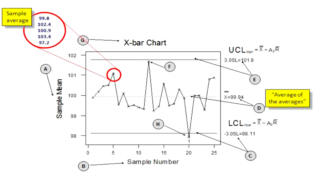
X-bar and Range Chart
- Used with time-ordered groups of data to detect short-term versus long-term variation
- Used with rational sub-groups such as
- Consecutive shifts
- Samples were taken on the hour every hour
- It consists of 2 control charts
- Xbar Chart – plots averages for each sub-group
- Range Chart – plots range (max/min) within each sub-group
Creating an X-bar and R Control Chart
- Choose what to measure
- Plan data collection
- Collect samples, record data
- Calculate the average for each sub-group and plot in time series – Xbar Chart
- Calculate the overall average of Xbar Chart X
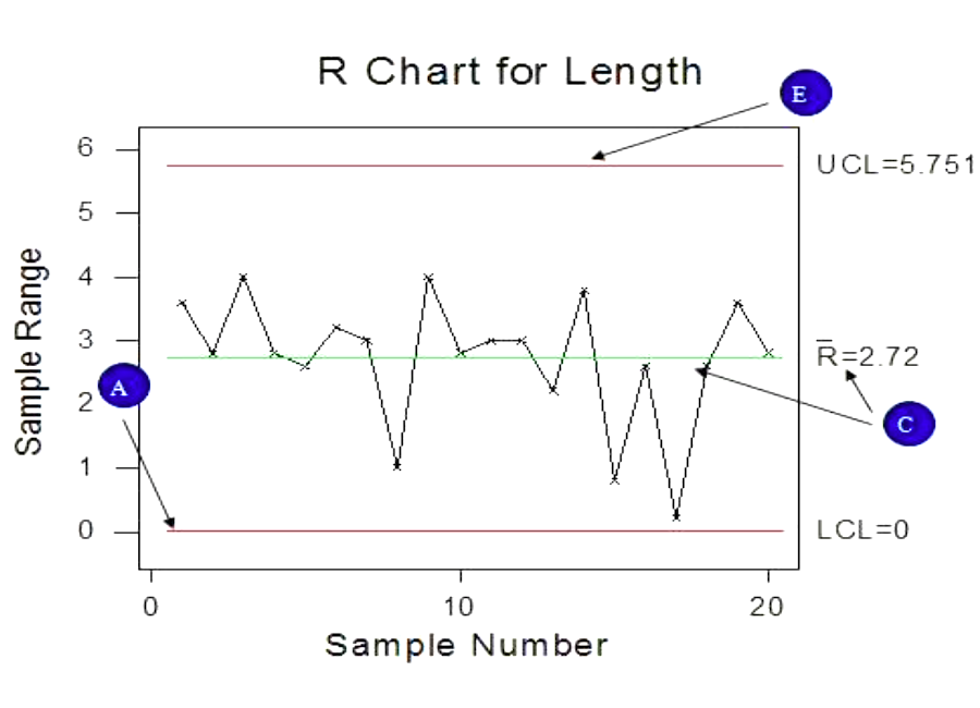
- Calculate the range for each sub-group and plot on Range Chart – R Chart
- Calculate the average of R Chart R
- Determine the control limit for ranges
- UCL=D4 x R
- LCL=D3 x R
- Ranges in statistical control?
- If not – variation exists within sub-group
- Determine control limits for averages
- Control Limits = X + A2 R
- Averages in statistical control?
- If yes – inherent (common) cause only
- If not – variation exists between sub-groups
Attribute Control Charts
- Set of control charts specifically designed for discrete or attribute data
- Seek to determine if the rate of non-conforming items (errors) is stable and detect when a deviation from the stable state has occurred
- The number of non-conforming items (errors) or conforming items may be plotted
Considerations for Attribute Charts
- Sample Size of Subgroup
- A sample size of each subgroup must be large enough to ensure there is at least one defect per subgroup
- A lower rate of defects in the process will require a larger sample size to monitor and detect changes
- Number of Data Points
- In most cases, attribute charts need at least 50 data points
u-Chart (Defect/Unit)
- The number of defects per unit (u) is calculated for each subgroup as the total number of defects (c) in the subgroup of size n
- These defects per unit are plotted on the control chart
- This chart does not require an equal subgroup size
- The average of the chart is calculated as:
- ubar = sum of all defects divided by the number of data points in all subgroups
- The control limits of the chart are calculated as:
- UCL = ubar + 3 √ubar/n
- LCL = ubar – 3 √ubar/n
p-Charts (Percentage of Defectives)
- The percentage of defectives are calculated for each subgroup
- This percentage of defectives is plotted on the control chart
- This chart does not require an equal subgroup size
- The average of the chart is calculated as:
- pbar = sum of all defectives divided by the number of data points in all subgroups
- The control limits of the chart are calculated as:
- UCL = pbar + 3 √ ((pbar(1 – pbar))/n
- LCL = pbar – 3 √ ((pbar(1 – pbar))/n
c-Charts (Count of Defects)
- The number of defects is counted for each subgroup
- This count of defects is plotted on the control chart
- This chart requires equal subgroup size – the same number of data points per subgroup
- The average of the chart is calculated as:
- cbar = sum of all defects divided by the number of subgroups
- The control limits of the chart are calculated as:
- UCL = cbar + 3 √ cbar
- LCL = cbar – 3 √ cbar
np-Charts (Count of Defectives)
- This number of defectives is plotted on the control chart
- This chart does require an equal subgroup size
- The average of the chart is calculated as:
- npbar = sum of all defectives divided by the total number of data points in all subgroups
- The control limits of the chart are calculated as:
- UCL = npbar + 3 √(npbar(1 – npbar)
- LCL = npbar – 3 √(npbar(1 – npbar)
Summary – Control Charts
- Report long-term capability
- Insight into what the process is doing
- Focus on consistent quality
- Enables targeting to specification
- Fire prevention vs. Fire fighting
- Often part of the process baseline in the Measure Phase and also the Control Plan


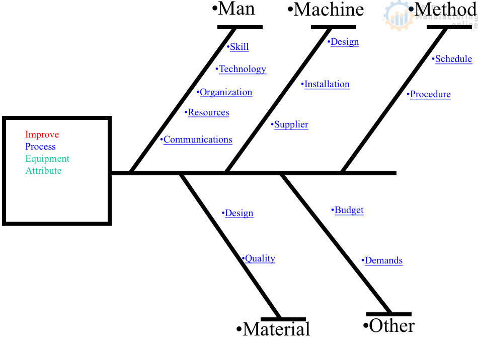
4M Analysis Process: Root Cause Guide for Manufacturing
Learn how to use 4M Analysis to find manufacturing root causes across People, Machine, Method, and Material with diagrams, examples, and checklist.