Once a Define phase has been completed, the next phase of your project is the Measure phase.
Let’s say from the Define phase, your project is to reduce long and inconsistent processing times. So, how long and how inconsistent are they?
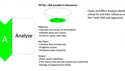
That is why you need a Measure phase, to measure and understand just how bad the problem is. The main focus of the Measure phase is to measure the Y in Y equals f of x.
The steps that make up the Measure phase are, first confirm the Y in Y equals f of x by reviewing all the outputs from the Define phase. Next, describe and map the current as-is process. You do this by starting with a high-level process map, then decompose the process as needed, using detailed process maps, or Swimlane deployment maps.
Make sure that process owners and other key process stakeholders are involved. Then, you can determine what’s critical to customers. In other words, develop your CTQs, or critical to quality requirements. A voice of the customer, a VOC analysis, is used to identify, prioritize, and translate customer needs into CTQs.
Then, you can develop a data collection plan for measuring Y.
You need to identify what questions need to be answered, what data, and how much data needs to be collected, by whom, from where, and by what means. Remember, the focus is on measuring Y.
The next step is to validate the measurement system to ensure the integrity of the data. You can conduct a measurement system analysis or MSA. If the results show that the measurement system is not valid, then improve it first, so the data to be collected and used is indeed valid.
Then, measure the baseline performance of Y. To do this, collect or measure performance data to answer the questions listed on your data collection plan. Tools you can use include sampling, sample size determination, process capability analysis, descriptive statistics, such as means and variances. You can also use:
- various graphs and charts, including
- run charts,
- SPC charts,
- boxplots,
- histograms, and bar charts or Pareto charts.
Performance of the relevant Y metric, such as percent on-time arrivals, processing times, and defect rates, can also be measured. Process capability, DPMO, and sigma levels are determined to establish a baseline. Last, identify key areas to focus on the project. Stratify the data to provide focus on who, what, when, and where to focus the analysis in the next phase. Tools that can help you stratify data depend on the type of data. Pareto charts are very useful for stratification if the data is discrete or categorical. For example, a number of complaints.
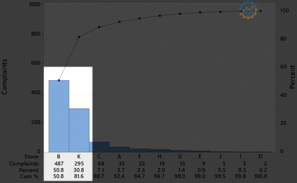
Let’s say if Locations B and K together have the highest number of total complaints, then focus on those two locations. Box Plots and Dot Plots are useful for stratification if the data is continuous data.
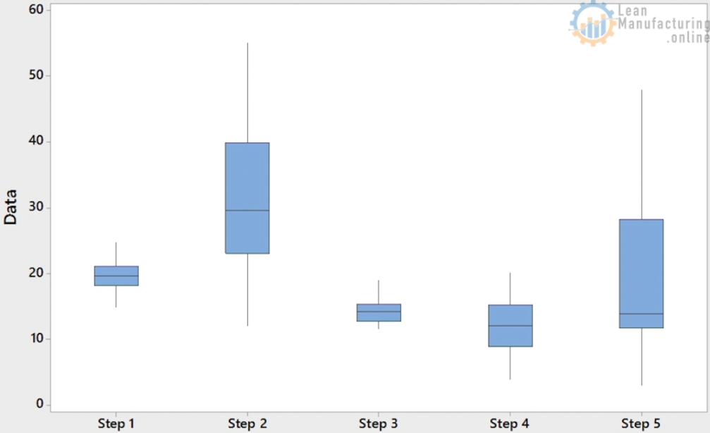
For example, processing times. Let’s say in a process with five steps, the processing times of Steps 2 and 5 are high and have the most variation. So, focus on those two steps. So, that’s an overview of the Measure phase. You can now measure the Y in Y equals f of x, and understand just how long and inconsistent the processing times are.


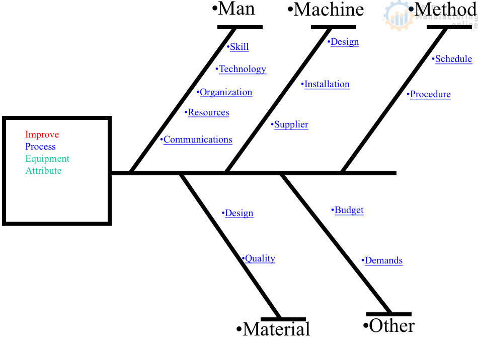
4M Analysis Process: Root Cause Guide for Manufacturing
Learn how to use 4M Analysis to find manufacturing root causes across People, Machine, Method, and Material with diagrams, examples, and checklist.