Pareto Charts allow you to focus your energy in the right spot. I’m sure you’ve heard of the 80/20 rule. 80% of the issues are created by 20% of the causes. The Pareto rule allows us to focus on the important things first.
A straightforward data analytical tool called a Pareto Chart is easily created through MS EXCEL.
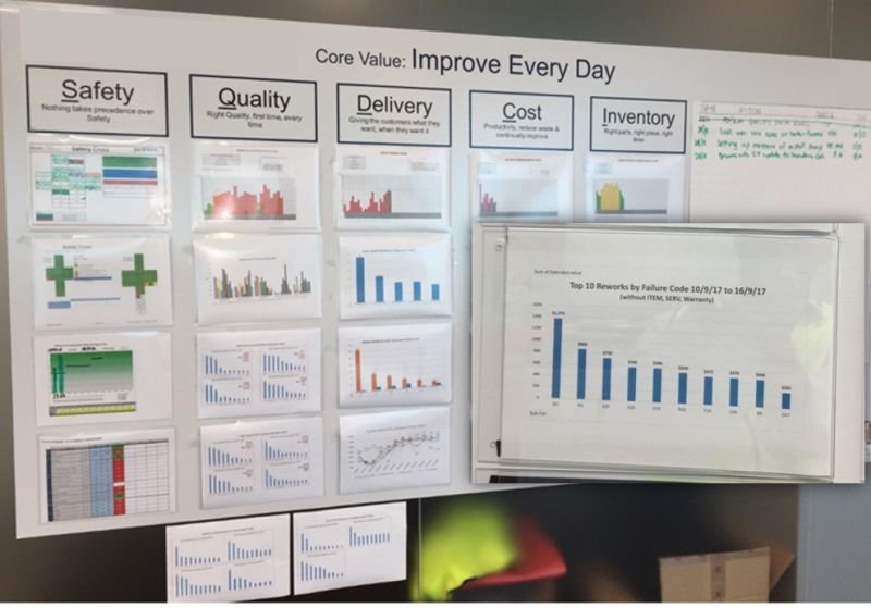
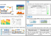
When I introduce and coach Daily Visual Management boards & routines, I love to direct users to this Pareto tool.
The DVM board below shows the top row of metrics being lagging indicators (already occurred), then the 2nd row below shows contributors to this lagging metric, displayed in order of influence. The 3rd row, in this case, is the Pareto of the 1st bar in the 1st chart (sometimes called “son of Pareto”).
The overall metric should improve by focusing on the critical contributor (the most extensive bar in the Pareto Chart) and resolving this. Then move on to concentrate on the 2nd largest bar and so on. See a link in the comments to an easy way to create a Pareto Chart in MS EXCEL. This is such a simple but powerful tool that I recommend should be part of any data analysis.
LinkedIn post by Paul Deane
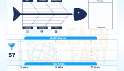


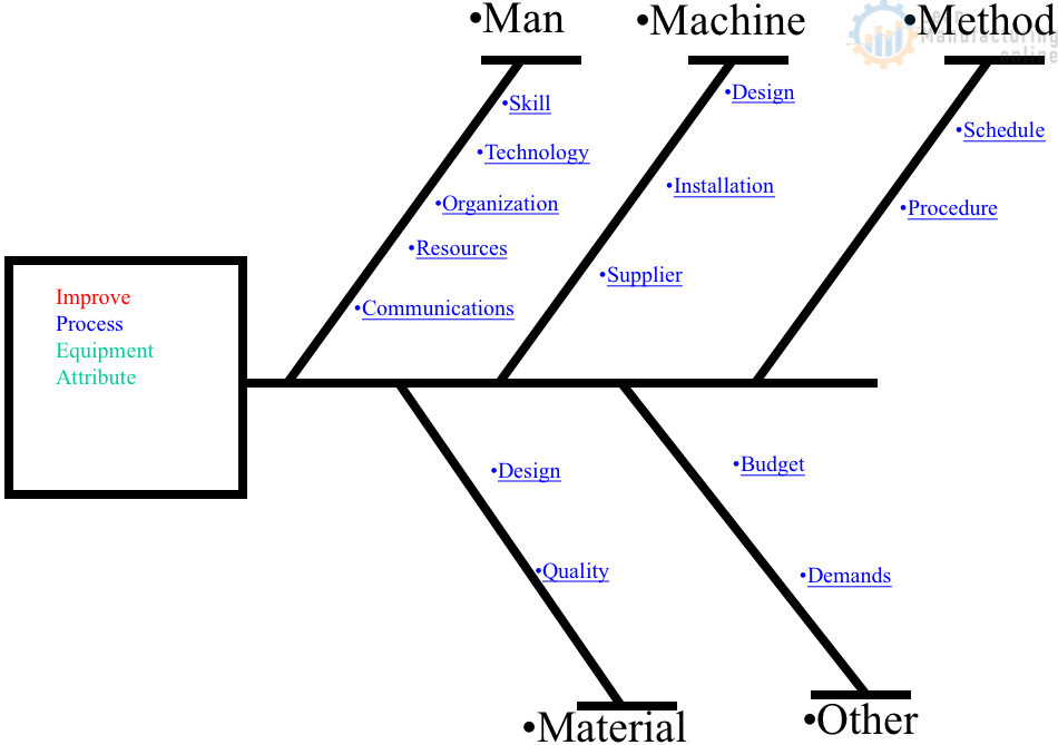
4M Analysis Process: Root Cause Guide for Manufacturing
Learn how to use 4M Analysis to find manufacturing root causes across People, Machine, Method, and Material with diagrams, examples, and checklist.
A link to an easy way to create a Pareto Chart in MS EXCEL.
Need download of using AI for excel