A Value Stream Map is…
A tool that helps visualize and understand the flow of material and information as a product or service makes its way through the value stream:
- A high-level map that visually presents the flow of a product or service from supplier to customer can be used to show both the current state and future state vision.
- Capture critical data regarding the flow of the products or services that help identify Value and Waste.
- It highlights waste and other problems specific to the process that causes barriers to flow.
Current state vs. future state
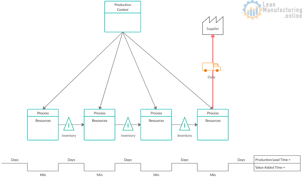
Current State Value Stream Map: a visual tool that shows all the actions (value-added and non-value added) currently required to bring a product through delivering it to a customer.
Future State Value Stream Map: the ultimate state where the individual processes are linked to their customers by continuous flow or pull. Each process gets as close as possible to producing only what its customers need when they need it.
How to create current state VSM
- Review entire value stream (flow) with the project team — establish consensus and familiarity with “flow” and steps;
- Gather information from the furthest downstream point, such as shipping, and work your way upstream. Use a pencil and paper, and sketch as you walk. It is a rough sketch; clean it up later;
- Collect data. Do not rely on standard times or information that you do not personally obtain (exceptions may be reliable data collected by automated systems);
- Map (brown paper, sticky notes) the value stream yourself with your team’s input. You must understand the whole.
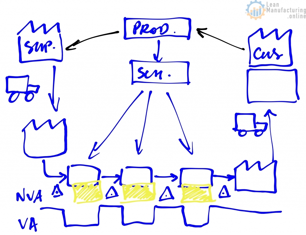
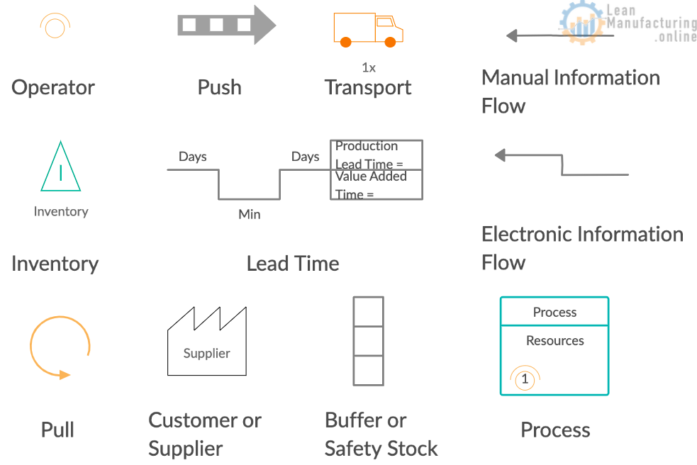
- Start with the customer requirements – Use the #customer icon to represent the customer in the upper right-hand portion of the page. Using a “data box” beneath the icon, record the customer’s requirements (CTQs, frequency, etc.);
- Draw the basic production or service processes in the lower half of the page using process boxes, from left to right (similar to #SIPOC);
- Include data boxes under each process box, recording data relevant to the purpose of your #valuestream map: #cycletime, #changeover time or delays/waits between process boxes. Include the number of people required to operate the process, touch time and frequency, etc.
- Use the triangle icon to illustrate where #inventory accumulates and how much;
- Use a transportation icon and arrow to indicate the movement of finished goods to the customer and materials from suppliers. – Indicate delivery frequency and size of #delivery, and identify raw material inventory or finished good storage using the inventory triangle.
- If a scheduling or planning/forecasting (MRP) system is used, identify this on the upper center portion of the page.
- Use the upper half of the page to draw information flow. Capture the steps of information flow and exchange as discrete activities, and use (electronic) arrows to indicate flow direction.
- If scheduling or production control is used, draw information flow from Production Control to all internal departments, including shipping.
- Use striped arrows to show material movements pushed by the producer, not pulled by the internal or external customer.
- “Push” means that a process produces something regardless of the actual needs of the downstream customer process and “pushes” it ahead. – Push results from producing to a schedule that guesses what the following process will need. – Supplying processes tend to make parts that customers don’t need immediately, and parts are pushed into storage.
- Use a “pull” arrow to show non-push material movements.
Lean Logistics & Supply Chain Optimization presentation can be downloaded here.

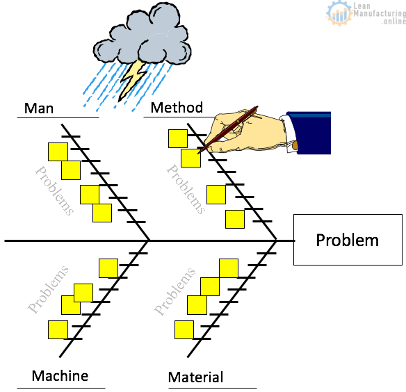


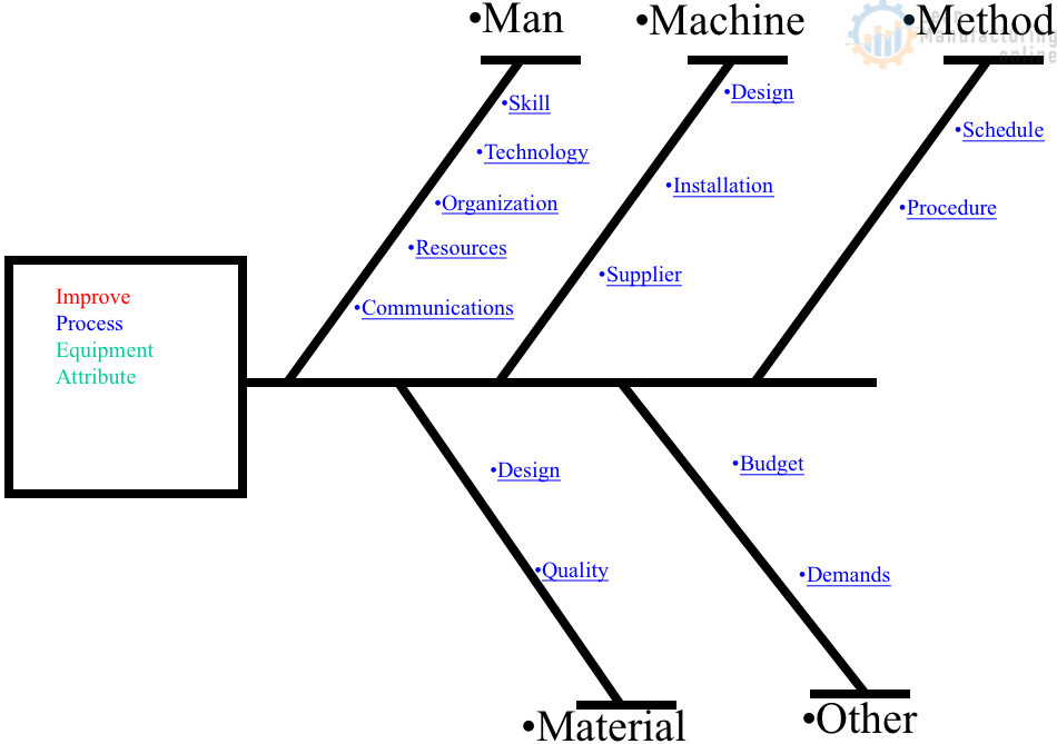
4M Analysis Process
The purpose of this procedure is to define the steps to do a 4M …