Quality control needs to be based on facts rather than experience or intuition.
The original purpose of quality control was to reduce the number of product defects in mass production, and their chief cause was thought to be variability, so statistical tools were used to address the problem. Statistical tools used in quality control include control charts, histograms, Pareto diagrams, the design of experiments, and sampling inspection. Non-statistical approaches, such as cause-and-effect diagrams, QFD, FMEA and FTA, are also used.
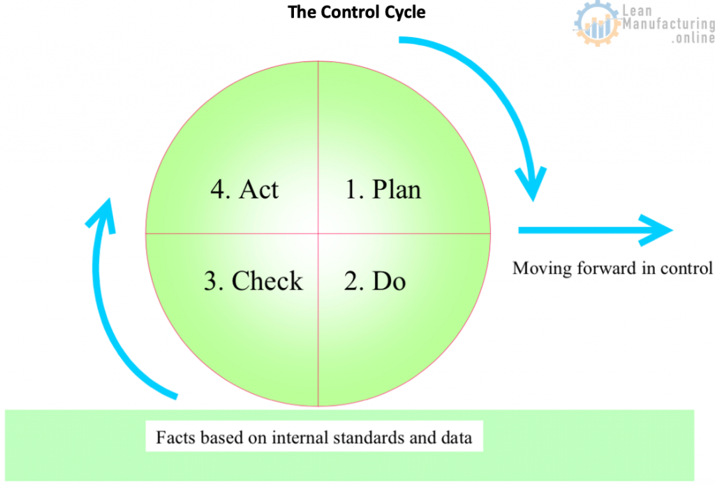
These methods focus on the graphic representation of data likely to prove useful in solving the problem, and their advantage is that they make the problem visible. Control makes it possible to achieve a planned value for a given task. The basic approach to control is to repeat the following sequence: Plan→ Do→Check (inspect/diagnose)→ Act (repair/improve). This is called the “PDCA cycle” or the “control cycle”; see the image below.
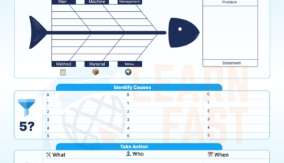
1. Cause-and-effect diagrams
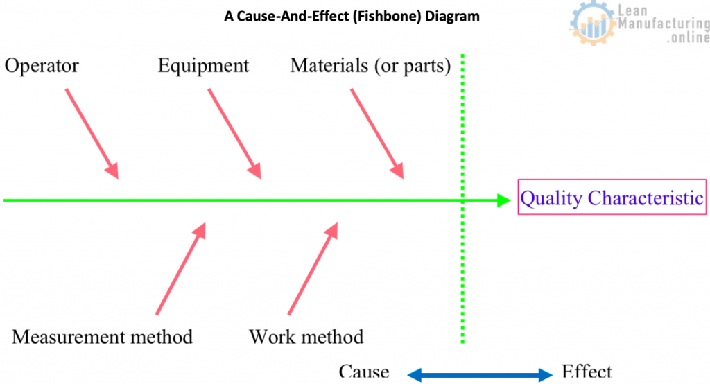
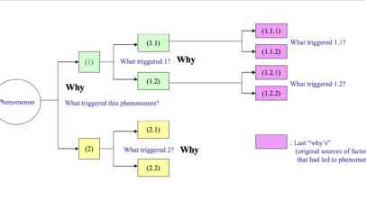
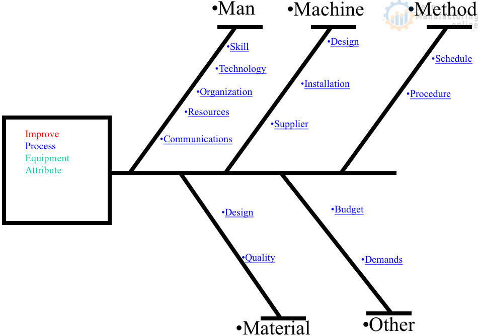
Also known as the fishbone diagram or Ishikawa diagram was developed by the Japanese quality guru Dr. Kaoru Ishikawa to express one of the basic principles of total quality management, that the desired product, target or other outcome is achieved not by directly controlling the results themselves but by controlling the processes that produce those results (since a process is a collection of causes leading to the results).
Cause-and-effect diagrams are sometimes called “4-M Diagram” or “4-M Analysis” (Man, Machine, Material, Method). Nowadays, it has been expanded to 6-M, adding Mother Nature (to analyze causes related to the Environment) and Measurement (part of the original Ishikawa diagram).
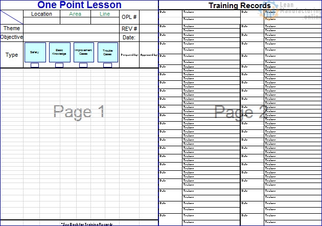
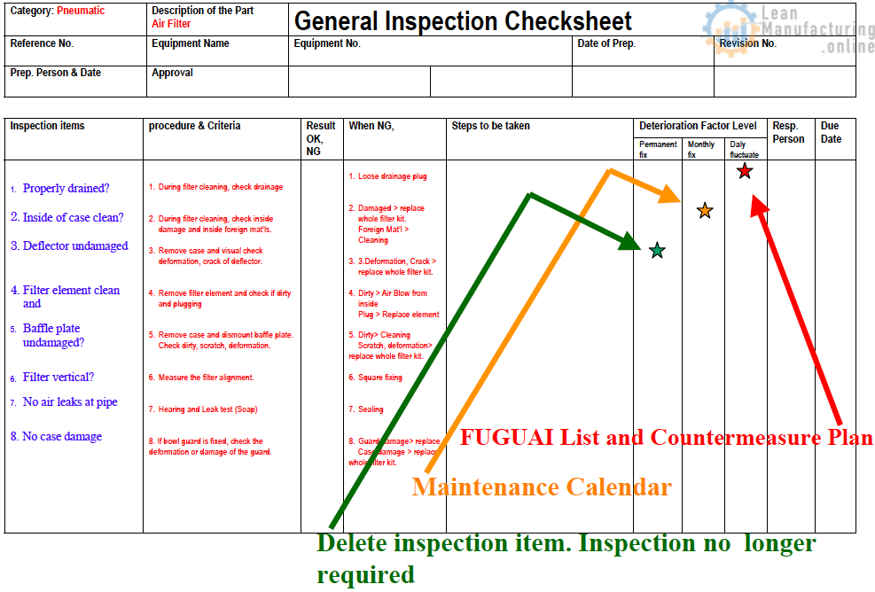
2. Checksheets
Checksheets are printed lists or diagrams of information required for control purposes. Once dealt with, each item is ticked, making data collection more efficient and transparent. Checksheets can be designed to investigate the distribution of process parameters, the occurrence or causes of product defects, or the location of equipment defects.
3. Histograms
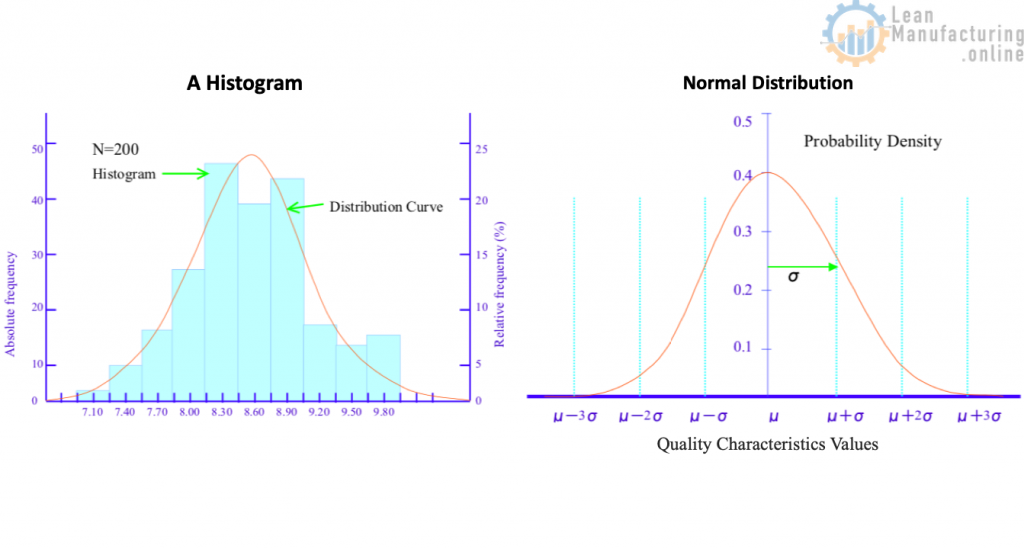
Although the overall distribution pattern can be deduced from the data points in a frequency distribution table, the distribution can also be represented as a column graph, known as a histogram, see the image below. Employed to reveal mean values and variation patterns, the histogram plays an important role as a process analysis technique for tasks such as checking for defectives by comparing product quality characteristics against standard values: – Frequency Distribution Tables – Normal Distribution – Standard Deviation
4. Pareto Diagrams
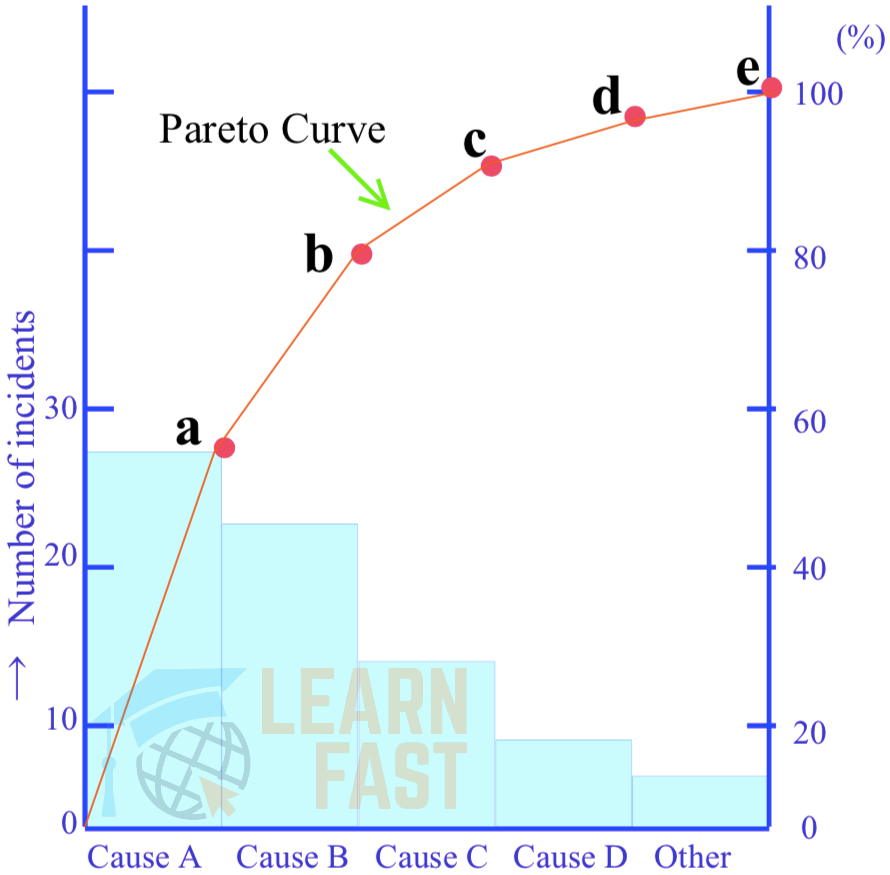
A Pareto diagram is a kind of frequency distribution graph. Imagine a set of data relating to equipment failures, rework, errors, complaints and other losses. The data specifies the financial cost of each loss, how often it occurs, what percentage of the total loss it accounts for, and so on. The losses may also be classified by their causes or the situations in which they appear. If this data is represented as a bar chart with the values in descending order, it will be obvious at a glance which category has the most failures, defects, etc. Plotting the cumulative total for each category on the resulting histogram will produce a Pareto diagram, as shown in the image. A Pareto diagram enables causes to be ranked and thus prioritized and tackled more effectively.
5. Scatter Diagrams
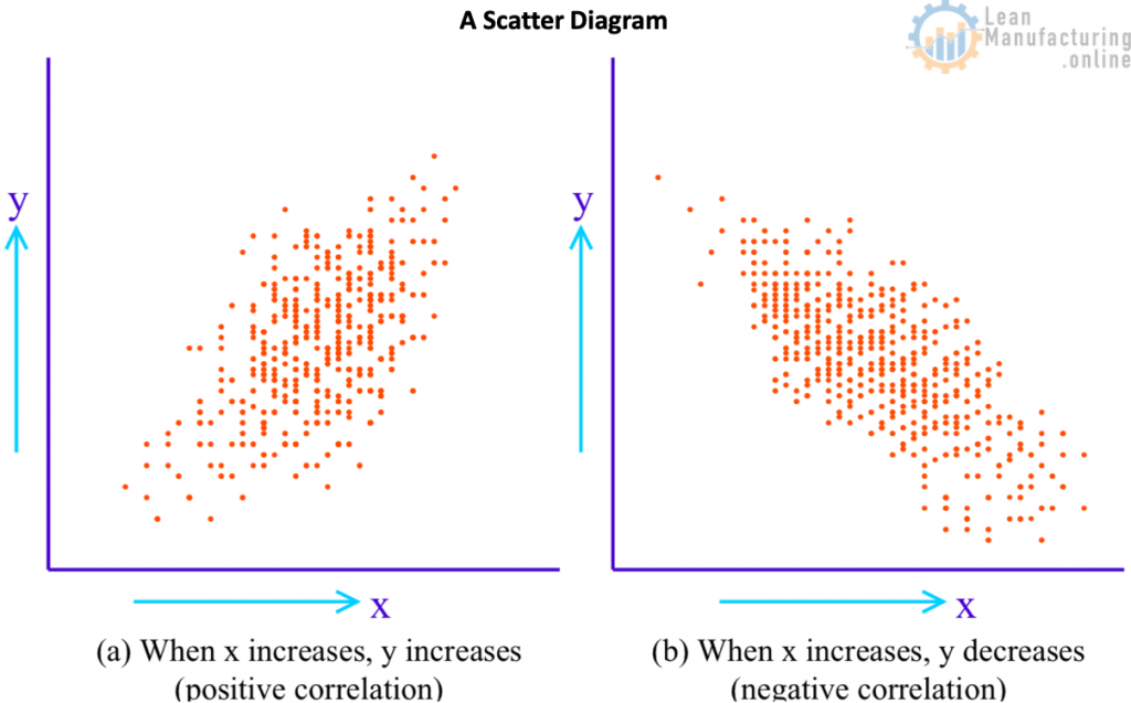
With a set of data of all of the same types, the overall distribution pattern can be found by a method such as plotting the frequency distribution. However, if there are two corresponding sets of data (such as height and weight), and the task is to find the relationship between the two, a scatter diagram, or scattergram, is used; see the image below. The relationship between two corresponding data sets, such as temperature and yield, or between workpiece dimensions before and after processing, is called a correlation. A correlation can be either positive or negative.
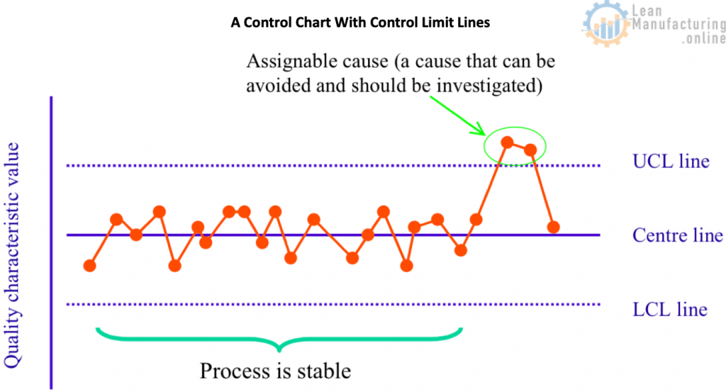
6. Control Charts
A control chart is a line graph on which control limit lines are plotted to determine if a process is in a stable condition or to keep it so. Control charts can be used for attributes (discrete data that, by its nature, can only be expressed as positive integers, such as numbers of people and incidences of failure) or for variables (continuous data such as length, weight, time or temperature). – X − R Control Chart – p Control Chart – np Control Chart – Control Limit lines Any graphical representation without control lines is simply a graph rather than a control chart. A control chart has a central line (CL), an upper control limit (UCL) and a lower control limit (LCL), collectively known as control lines; see the image below.
7. Graphs and charts
These are the basic tools of statistical control. Statistical control techniques are used to clarify the severity of problems and identify their causes. Although problems cannot be solved by graphs and charts alone, they can help track down their causes. For this reason, graphs and charts are an essential part of the problem-solving toolkit.
- Bar Charts
- Pie Charts
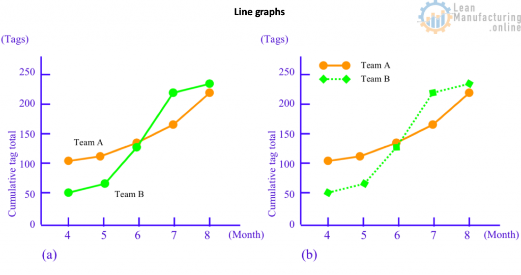
- Line Graphs
- As mentioned, line graphs show how a quantity changes, especially over time. They are also known as function graphs, broken-line graphs, or time-series charts. In contrast to bar charts, which are characterized by comparing quantities at a fixed point in time, the chief feature of line graphs is that they provide an intuitive, overall insight into how a phenomenon varies over time. It is, therefore, important to emphasize the points rather than the lines when drawing them; see the image.
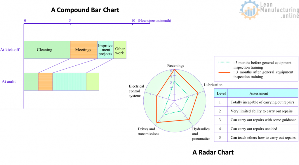
- Compound Bar Charts
- Although we have now established that the three basic types of graphs are bar charts, pie charts and line graphs, their applications are many and varied. Some of the more commonly used varieties include compound bar charts (also known as stacked bar charts or strip charts; see slide), pictographs, area graphs, volume charts and combination graphs.
- Radar Charts
- A radar chart is a graph used to portray the balance between multiple indicators (in other words, the overall skew or the relationship of the individual values to the mean) and the gaps between the actual and the ideal; see the image below. The chart has a central point, which radiates several spokes, each corresponding to the axis for a certain indicator, and the value for each indicator is shown by plotting a point on its spoke at an appropriate distance from the centre. Radar charts represent quality awareness, 5S performance, training results, and other intangible benefits.
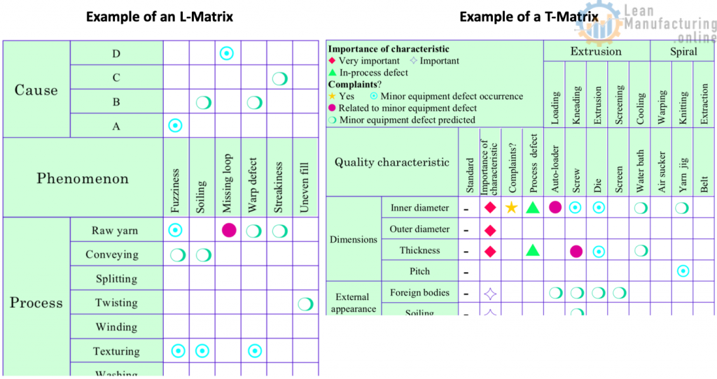
- Matrices A matrix is a table in which the problem phenomena and their potential causes are arranged in opposing rows and columns. A symbol is inserted in a cell to indicate whether the potential cause associated with that cell is relevant to the corresponding problem and, if so, to what extent. This is a very effective way of triggering good ideas for solving problems. The image shows a QA matrix (an L matrix because of its shape) in which two factors – quality characteristics and processes – are opposed. The slide also shows a T matrix contrasting three factors – processes, phenomena and causes.
Drawing upon lean manufacturing and quality control principles, our journey through the 7 QC tools has explored the depth and breadth of essential strategies in today’s production processes. These tools provide a diverse set of techniques that allow us to observe, analyze, and control the multifaceted elements of production, with the ultimate goal of enhancing efficiency and minimizing variability.
Last updated on Mar 23, 2025.


4M Analysis Process: Root Cause Guide for Manufacturing
Learn how to use 4M Analysis to find manufacturing root causes across People, Machine, Method, and Material with diagrams, examples, and checklist.