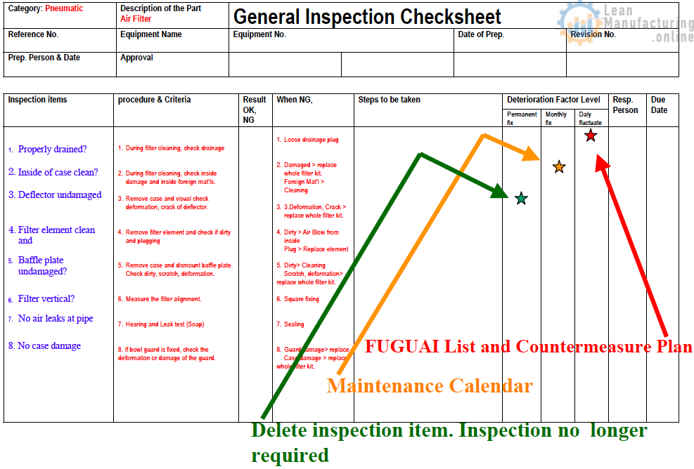
(7) Graphs and Charts
Graphs and charts are the basic tools of statistical control. The purpose of using statistical control techniques is to clarify the severity of problems and identify their causes. Although problems cannot be solved by graphs and charts alone, they can certainly help in tracking down their causes. For this reason, graphs and charts are an essential part of the problem-solving toolkit.
1 Bar Charts
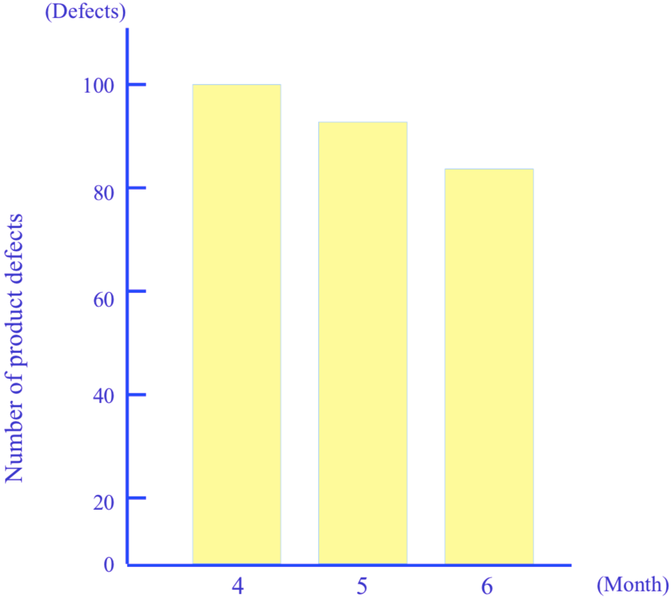
A bar chart is used to compare two or more quantities by representing them as bars with the same width, and lengths proportional to the size of the quantity. Bar charts can be either vertical or horizontal, although vertical bar charts are more commonly used. Bar charts rank with line graphs as the most useful form of graph or chart and are in fact used even more often (see Figure “A Bar Chart”).
2 Pie Charts
A pie chart is a graph in which a data set represented by a circle is broken down into categories, each represented by a segment of the circle, or a “slice of pie”, the size of each slice corresponding to the proportion of that category in relation to the whole. The principal purpose of a pie chart is to compare the sizes of the slices.
Pie charts are less commonly known as circle graphs. Sometimes, a concentric circle containing different data is drawn inside the first circle, and the resultant graph is known as a ‘doughnut chart’ (see Figure “Pie Charts”).

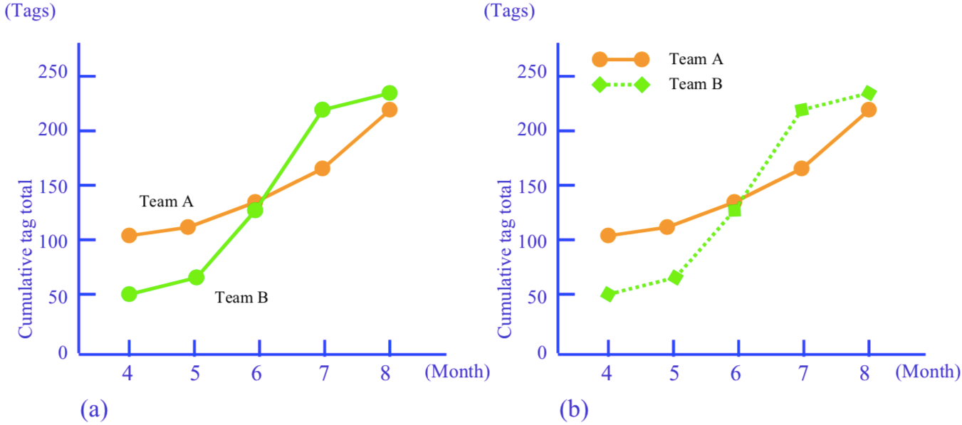
3 Line Graphs
As mentioned before, line graphs show how a quantity changes, especially over time. They are also known as function graphs, broken-line graphs, or time-series charts. In contrast to bar charts, which are characterized by the fact that they compare quantities at a fixed point in time, the chief feature of line graphs is that they provide intuitive, overall insight into how a phenomenon varies over time. It is therefore important to emphasize the points rather than the lines when drawing them (see Figure “Line graphs”).
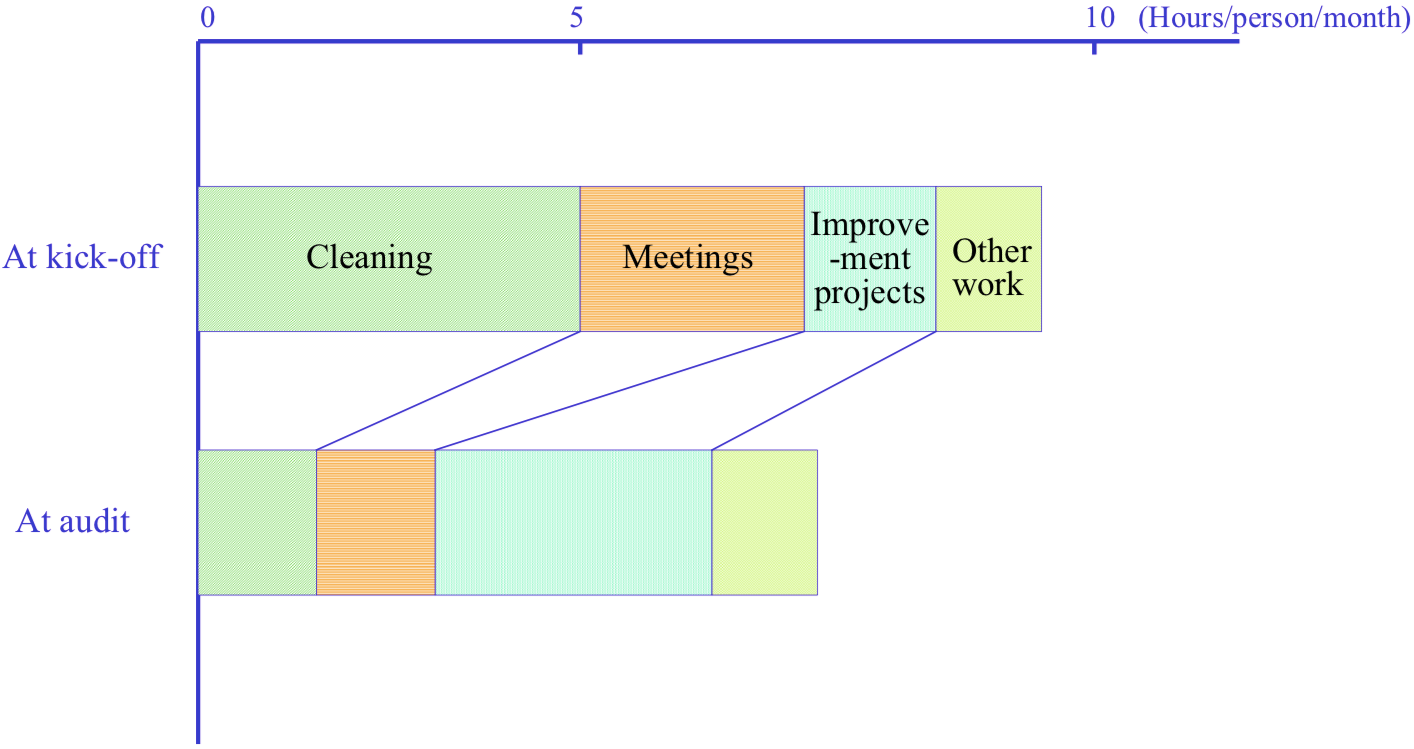
4 Compound Bar Charts
Although we have now established that the three basic types of graphs are bar charts, pie charts and line graphs, their applications are many and varied. Some of the more commonly used varieties include compound bar charts (also known as stacked bar charts or strip charts; see Figure “A Compound Bar Chart”), pictographs, area graphs, volume charts and combination graphs.
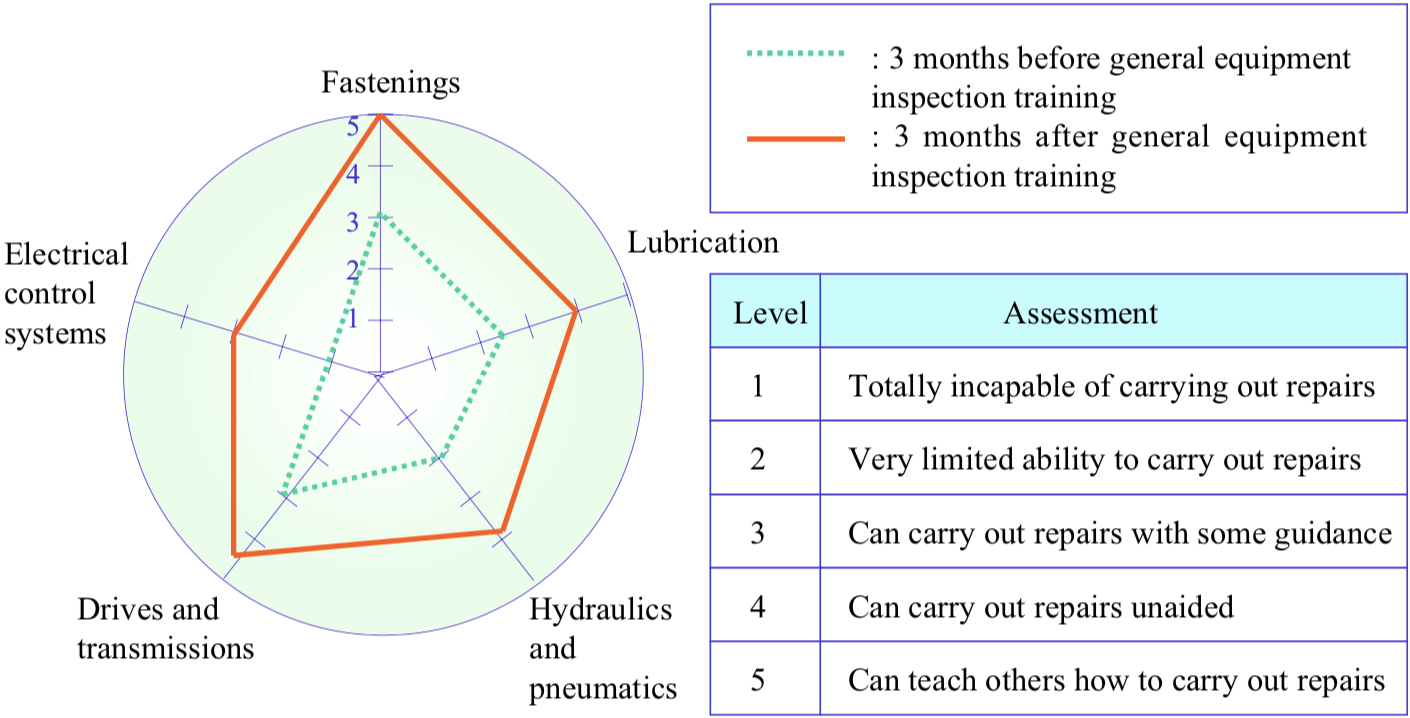
5 Radar Charts
A radar chart is a graph used to portray the balance between multiple indicators (in other words, the overall skew, or the relationship of the individual values to the mean), and the gaps between the actual and the ideal (see Figure “A Radar Chart”). The chart has a central point, from which radiate a number of spokes, each corresponding to the axis for a certain indicator, and the value for each indicator is shown by plotting a point on its spoke at an appropriate distance from the centre. Radar charts are useful for representing quality awareness, 5S performance, training results, and other intangible benefits.
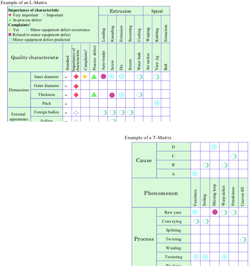
6 Matrices
A matrix is a table in which the problem phenomena and their potential causes are arranged in opposing rows and columns. A symbol is inserted in a cell to indicate whether the potential cause associated with that cell is relevant to the corresponding problem, and if so, to what extent. This is a very effective way of triggering good ideas for solving problems. Figure “Matrices” shows a QA matrix (called an L matrix because of its shape) in which two factors – quality characteristics and processes – are opposed. This kind of matrix is often used in Quality Maintenance. The figure also shows a T matrix contrasting three factors – processes, phenomena and causes.

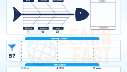


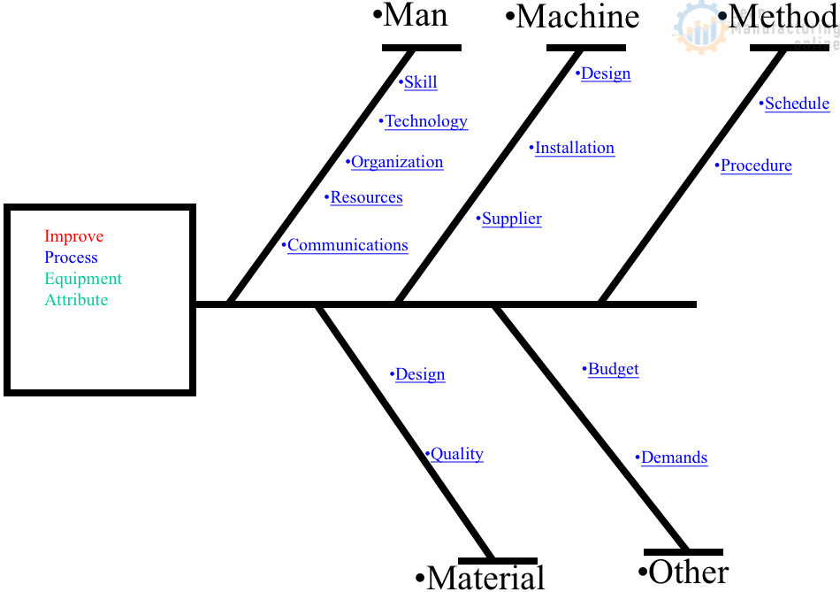
4M Analysis Process: Root Cause Guide for Manufacturing
Learn how to use 4M Analysis to find manufacturing root causes across People, Machine, Method, and Material with diagrams, examples, and checklist.