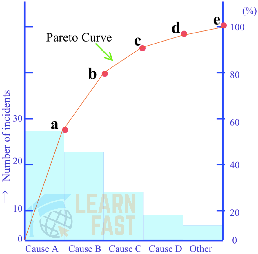
(4) Pareto Diagrams
A Pareto diagram is a kind of frequency distribution graph. Imagine a set of data relating to equipment failures, rework, errors, complaints and other losses. The data specifies the financial cost of each loss, how often it occurs, what percentage of the total loss it accounts for, and so on. The losses may also be classified by their causes or by the situations in which they appear. If this data is represented in the form of a bar chart with the values in descending order, it will be obvious at a glance which category has the most failures, defects, etc. Plotting the cumulative total for each category on the resulting histogram will produce a Pareto diagram (see Figure “A Pareto Diagram”). A Pareto diagram enables causes to be ranked, and thus prioritized and tackled more effectively.
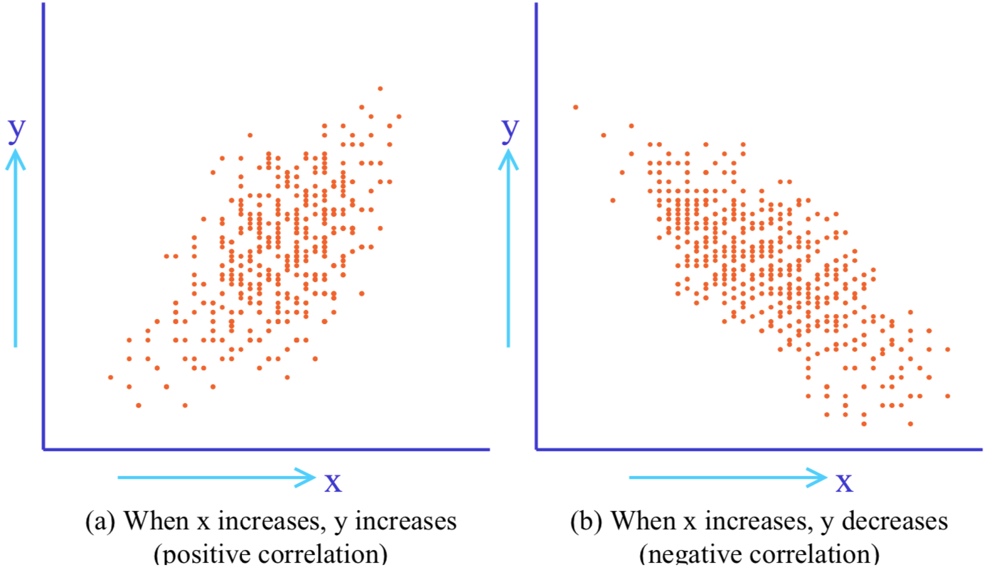
(5) Scatter Diagrams
With a set of data all of the same type, the overall distribution pattern can be found by a method such as plotting the frequency distribution. However, if there are two corresponding sets of data (such as height and weight), and the task is to find the relationship between the two, a scatter diagram or scattergram, is used (see Figure “A Scatter Diagram”). The relationship between two corresponding sets of data such as temperature and yield, or between workpiece dimensions before and after processing, is called a correlation. A correlation can be either positive or negative.


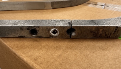

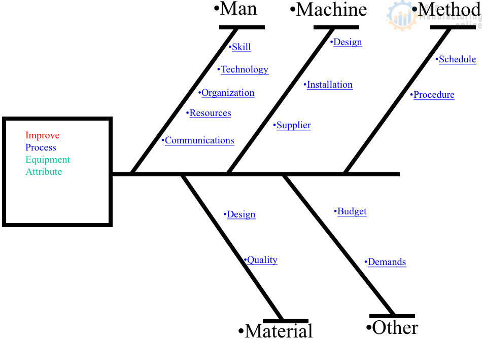
4M Analysis Process: Root Cause Guide for Manufacturing
Learn how to use 4M Analysis to find manufacturing root causes across People, Machine, Method, and Material with diagrams, examples, and checklist.
Thanks 👍